|
Actual Generation - High or Low?I first asked this question at the end of August 2010 after the first month of generation. The only figure we had was that we would be expected to generate 3405 kWh in a year. What we needed was expected monthly figures. After some research I drew this chart of the expected kWh per month for our PV solar system. 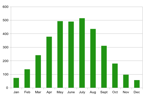
The above chart is based on information from a number of sources. First Month - High or Low?I adjusted the actual generation figures for August upwards to take into account that the system was not turned on until 5th August and came up with a figure for August of 373 kWh. This I found a little disappointing as the expected generation was 435 kWh. Why was the actual figure so low?August 2010 was not a sunny month and the amount of electricity generated is very dependent on the amount of sunshine. This set me thinking: how did it compare with other Augusts? I found the sunshine data I was looking for on the Met Office website which publishes historic weather records for the main weather stations in the UK. I selected Hurn, our nearest weather station then downloaded and analysed the data calculating the minimum, average and maximum sunshine hours for each month. 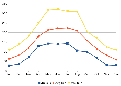
The above chart is based on Met Office sunshine data going back to 1968. How did the sunshine hours for August 2010 compare?It was a new record low for August. Assuming that the amount of electricity generated is proportional to the amount of sunshine, for an average August the system could have generated over 700 kWh which is well over what I would have expected. Is the relationship between sunshine hours and kWh valid?After 12 more months of real data, I have come to the conclusion that the relationship between sunshine hours and kWh generated is reasonably good. This is illustrated by the following 2 charts. The first compares the average sunshine hours with the actual sunshine hours. The second compares the expected kWh (based on: 3 kWh per sunshine hour) with the actual generated kWh. They do seem to be very similar. 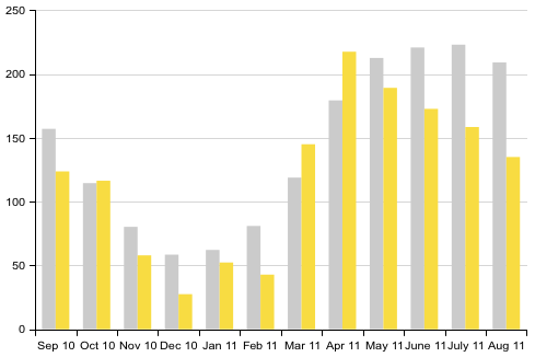
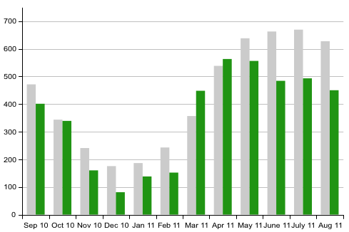
First Year - High or Low?The 12 months data shown on the chart was a very poor year for sunshine: 1438 hrs. This is well below the average for the area of: 1717 hrs. In the same period our system generated 4265 kWh which ties in with the 3kWh per sunshine hour. ConclusionDue to a poor year for sunshine, the first years solar generation was low. Based on the actual electricity generated so far and the average sunshine expected for our area I now expect that our system will generate about 5100 kWh per year, much higher than the expected 3405 kWh. Are these numbers generally applicable?You may not get such high figures as they are based on:
Beware, we are on the English South Coast, probably one of the best area in the UK for PV solar. It would be very interesting to get generation data from other locations in the UK to validate the link between sunshine and kWh. If you have a set of monthly figures for elsewhere in the UK please get in touch.
| |||||||||||||||||||||||||||||||||||||||


| © J. Ansell 2015 |